In Stars and Time
Devlog #12: Localization Milestone and Key Art
Hello everyone! Welcome to this month’s devlog!
If you just stumbled upon this, I am Adrienne, also known as insertdisc5! I’m the developer, writer, artist, main programmer, etc of the game. The game being In Stars and Time, a timeloop RPG, which is also the next and final game in the START AGAIN series, following START AGAIN: a prologue (available here!). You can find out more about In Stars and Time here!!!
LET’S GET TO IT. This month has some localization news, as well as a breakdown on key art! What’s key art? Where do you use it? Can you eat it? Read and find out.
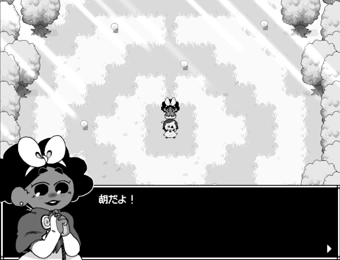
The first pass of the Japanese localization is done and implemented!!! You can play the whole game in Japanese from beginning to end now!!!
The next step now is the localization QA, where the localization team plays the game and makes sure the Japanese script works in context. The team got the script in an excel sheet and I tried my best to give context for scenes where I could, but playing through the game themselves allows them to get The Most Context. All Of The Context. So they can make changes to their localization so it can be the best!!!
That’s it for news. Other things are chugga-chugga-chuggin’ behind the scenes as well, and I can’t wait to share it all with you all!!!
Today’s topic-since-I-don’t-have-much-to-talk-about is: key art!
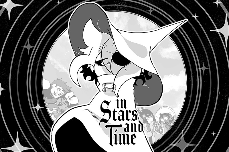
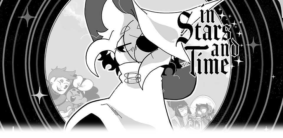
“Adrienne what on Earth is a ‘key art’” This above is the key art for In Stars and Time.
More generally (and keep in mind this is my layman self talking, I’m sure you could get a better answer elsewhere, but also you’re here, so you might as well learn something huh???), key art is The Big Art that games (and, I assume, other mediums???) use to show off their style and visuals in things such as store fronts, articles, and other such things. It’s Mario jumping in a cool way with his lil star buddy while the planets are behind him. It’s Kratos and Atreus on a boat. It’s sad Siffrin in the foreground, surrounded by stars, while his friends are having fun in the background. It’s The Art!!! It’s the first thing people see about your game!!! It needs to be cool and represent your game!!!
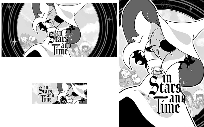
Here’s some examples of the key art being used for Steam store assets. Itch.io is very kind and asks for like 2 assets, but Steam asks for a whoopin’ 30 assets, all with different sizes and orientations, so it means one of the biggest things your key art should be is MODULAR AS HELL. From a massive 1440x3160 vertical banner to an itty-bitty 231x87 horizontal button (called a capsule, it’s the small banner above, and since it’ usually the first thing you see about a game it is THE MOST IMPORTANT ASSET), your key art needs to be ready for anything!!!
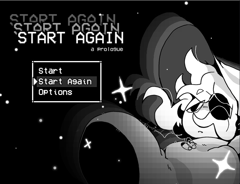
For the prologue, I did not plan for this very well. I learned pretty late in development that store assets for itch.io (and later, Steam) were gonna be a thing I should worry about, so I ended up deciding to use the title card art. Which, like, it worked out.
BUT! I had to redraw Siffrin to make sure their hat and body weren’t weirdly cut out, and had to remake the pixelly gradient like a thousand times for each asset to make sure it wouldn’t hide Siffrin’s face. And that’s without mentioning the hell I went through to make sure the massive title logo would fit. Why did I think “START AGAIN START AGAIN START AGAIN: a prologue” was a good title. It was so hard to make it fit in its entirety every time (because, of course, Steam asks you to show the logo in its entirety in every single asset). Why did I choose this title (I’m a Kingdom Hearts fan and my heart is rotten and thinks long titles are funny)
So since I went through hell with START AGAIN’s store assets, for ISAT I made sure to think about the key art way ahead of time teehee.
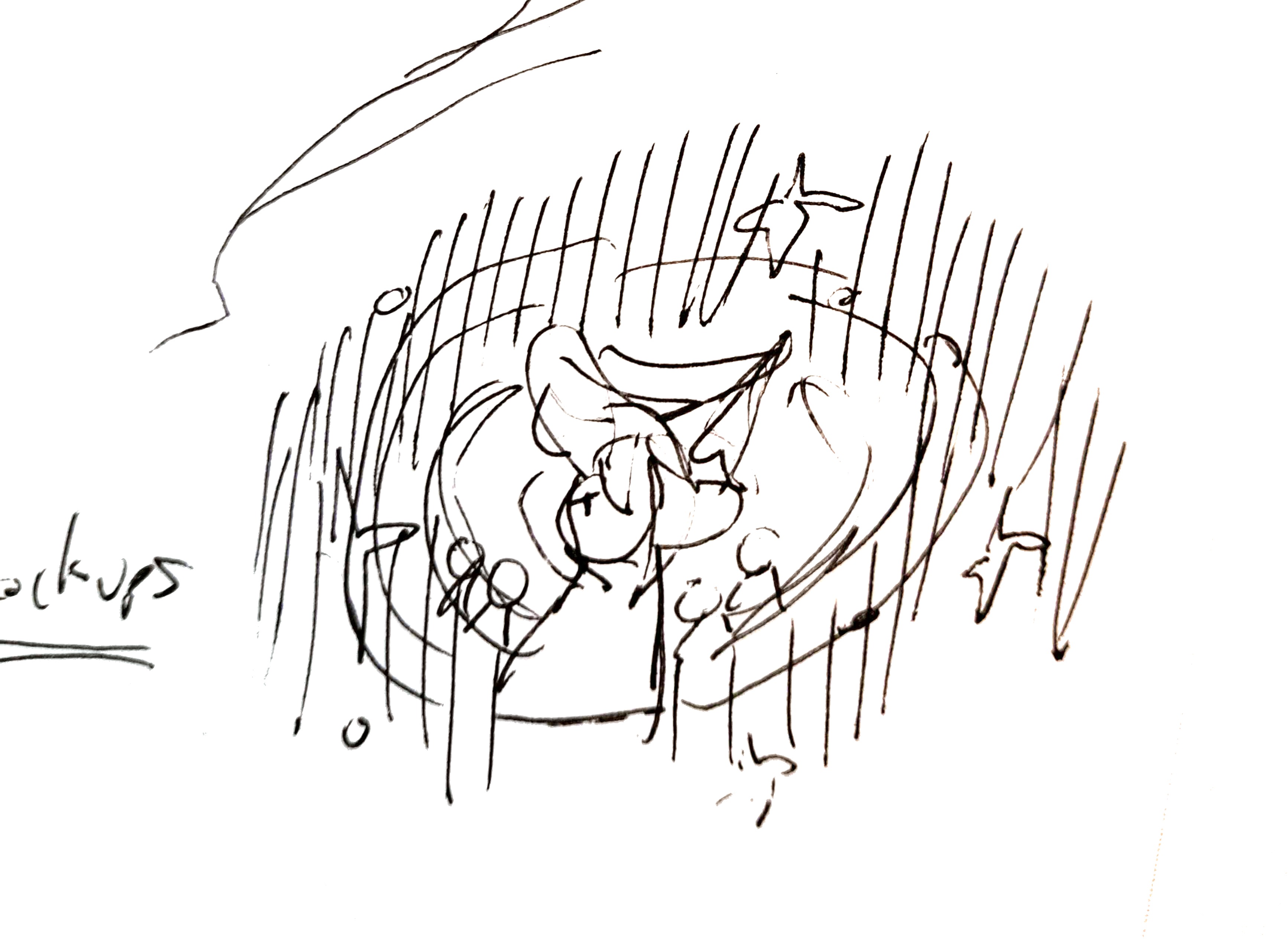
Every so often I become an absolute genius so I only had to sketch the key art once, as you can see above. You don’t need to understand it because I do and it’s all that matters. Teehee!
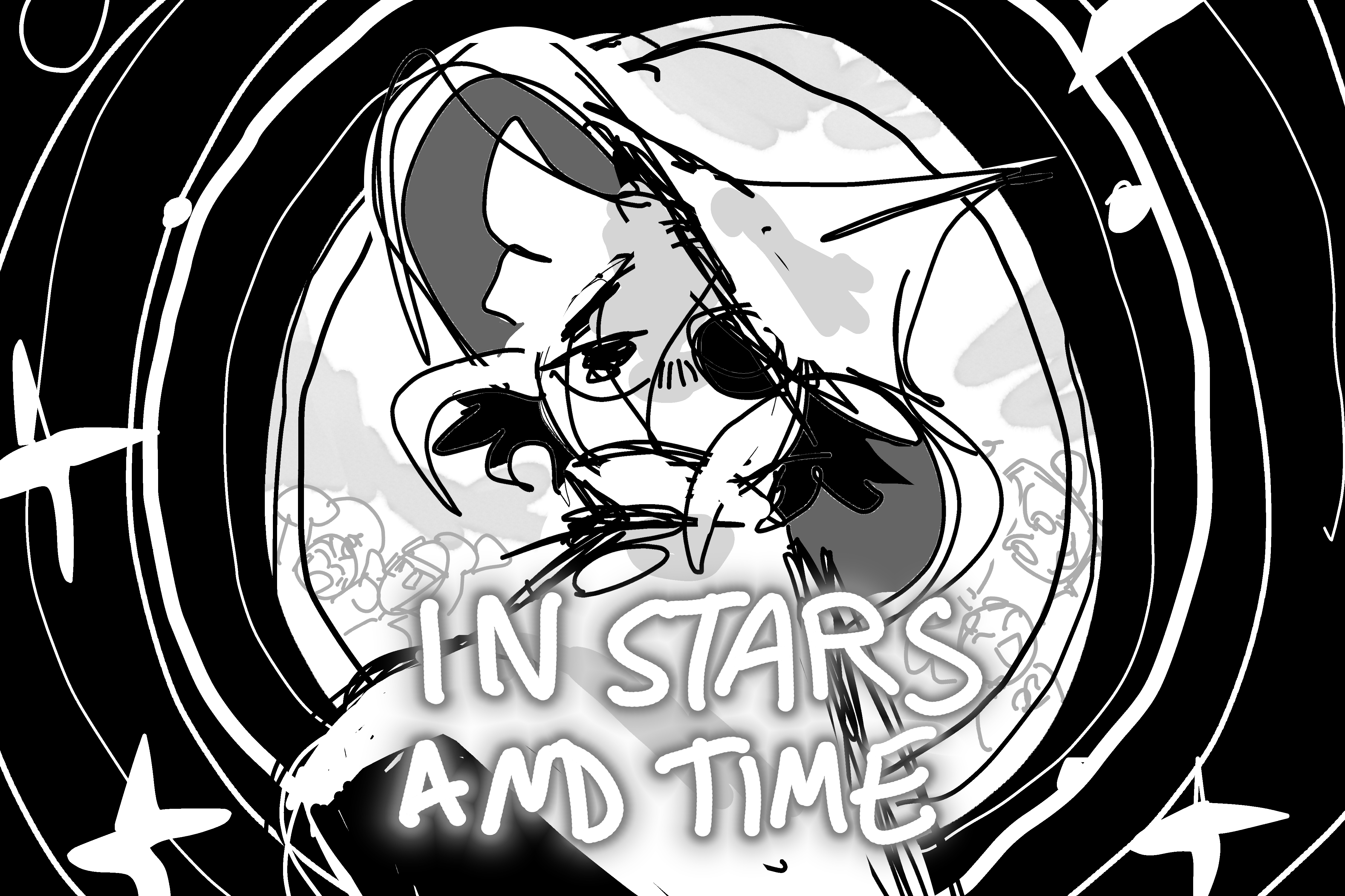
Here's the rough illustration! I made it to block out the shapes, and figure out where that dang logo would go. Once again, reminder: if you have text of any kind, figure out where it goes in the rough stage. Future you will thank you. I also had Siffrin look directly at the camera in this rough stage, and then figured. That it would look sadder. If Siffrin looked emo-ly to the side. I do like the look at the camera though. He Is Looking
To talk about The Meaning very quickly, I wanted to show Siffrin front and center, since the whole story is about them. And I wanted to show the whole party, but clearly separated from Siffrin- Siffrin is stuck in a time loop, feels completely apart from them, and I wanted to show that in the key art! With the expressions too- everyone else is happy or engaged in something, interacting with each other, while Siffrin is in his emo phase. And also stars everywhere. Because of course.

Here are all the layers I used- I made sure to draw them on a vector layer in Clip Studio Paint, which means the lines never become pixelated even if you zoom in a lot! As a side note, the full file for this is 4000x3000, which I thought would be too big, but is actually just the right size for all those dang assets.
I also made sure that Siffrin would look the most detailed, since I knew that while everyone could fit for the bigger pictures, for the itty-bitty small ones (or the extremely horizontal ones), I would only show off Siffrin’s face. MODULAR!!!!!
In the end this key art worked pretty well to make the store assets, but if I could talk to past me I would tell them. Make the circle bg taller so it’d fit the more vertical assets. And find a way to leave more space for the characters in the background. I had to remove them/rotate them/zoom them out very often because Siffrin hides them too much because Siffrin is just too dang big. But that’s still manageable, past me. You did a good job past me
So, TLDR, from my experience, what you need to keep in mind when making your key art is:
-make sure it has enough layers to be able to move things around as needed, but not so many layers that you become lost
-fun art that represents your game and its vibe well
-cool everywhere, but able to get by if you zoom in on one thing (which usually for ISAT’s assets is Siffrin’s face)
-able to work in a vertical and horizontal format and at many different sizes
I hope my key art made people interested enough in the game to try to find out more!!
That’s all I have to say for today! Let me know if you have any questions, or if there’s any aspect of the game development struggle you’d like me to talk about! See you next time!!!
AND DON’T FORGET TO WISHLIST THE GAME ON STEAM ALSO IT REALLY HELPS BECAUSE STEAM’S ALGORITHM IS MORE LIKELY TO SHOW OFF GAMES WITH A HIGH AMOUNT OF WISHLISTS THAT’S THE REASON WHY GAME DEVS ALWAYS ASK TO WISHLIST!!! OKAY BYE!!!!
Leave a comment
Log in with itch.io to leave a comment.